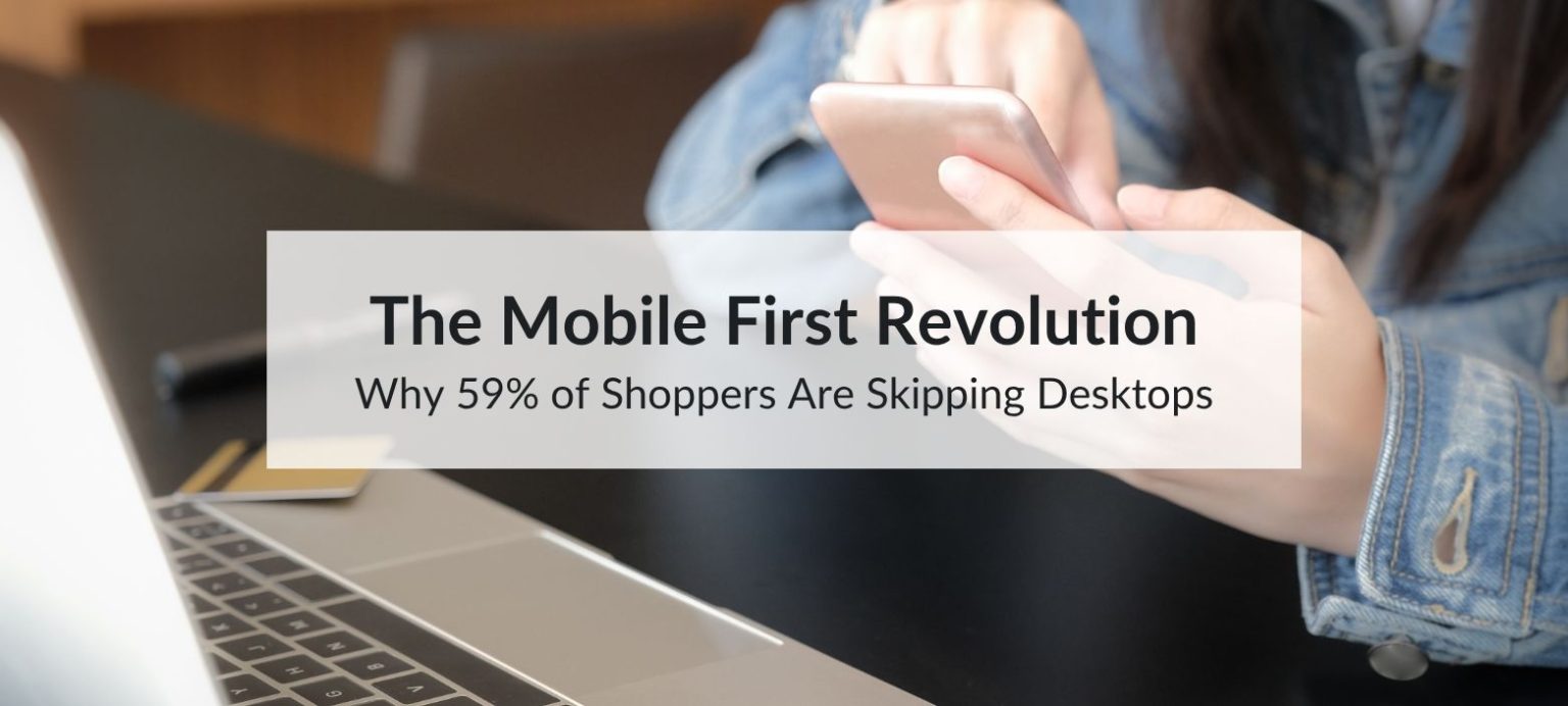
Online shopping used to happen mostly on desktops, but things have changed. A recent ecommerce report by Salsify shows that 59% of people now prefer to shop using their smartphones. This shift to mobile-first shopping means only 28% use a desktop or laptop, and just 10% use tablets.
That means mobile devices are now the most popular way to shop online. If your website isn’t built with mobile users in mind first, you’re likely missing out on sales.
Table of Contents
The Numbers Behind the Shift to Mobile
Here’s what the data tells us:
- 59% of shoppers prefer mobile over any other device
- 69% of mobile users shop through marketplace apps like Amazon and eBay
- Discounts and limited-time offers work best on mobile — 62% of consumers said these deals make them more likely to buy
- Flash sales and mobile notifications often lead to unplanned purchases — 70% of shoppers say they’ve made impulse purchases online after receiving a discount
People are using their phones to browse, compare, and buy products. The easier you make it for them to shop from their phone, the more likely they are to complete a purchase.
Why People Choose Mobile Over Desktop
1. It's Convenient
Most people always have their phones with them. They shop during commutes, lunch breaks, or while watching TV. Phones make it easy to buy something the moment they think of it.
2. Apps Make It Easier
Apps from retailers and marketplaces are designed for quick use. Shoppers get faster search results, saved info, and smooth checkouts. Marketplace apps are used by 69% of mobile shoppers.
3. Exclusive Deals
Some brands offer mobile-only discounts or send push notifications with time-limited offers. These can lead to quick, unplanned purchases — especially when combined with good design and fast load times.
What “Mobile First” Means
A mobile-first site is designed from the start with phone users in mind. It’s simple, fast, and easy to use on a small screen.
It doesn’t mean shrinking a desktop site to fit a mobile screen. It means creating something that works well on phones first, then adapting it for larger screens if needed.
Signs Your Store Isn’t Mobile First Yet
- Your site takes more than 3 seconds to load on a phone
- Text and buttons are hard to read or tap
- Product filters don’t work well on smaller screens
- Checkout is slow or asks for too many details
- Your site doesn’t switch to mobile view when opened on a phone
Google research shows that 53% of users will leave a mobile site if it takes longer than 3 seconds to load.
How to Make Your Store Mobile First
1. Speed Up Your Website
Use tools like Google PageSpeed Insights or Lighthouse to test your mobile speed. Focus on:
- Fast loading times
- Responsive images
- Fewer scripts and redirects
2. Keep It Simple
Use large, clear text and buttons that are easy to tap. Keep menus short. Make filters easy to use and checkout quick.
3. Improve Product Pages for Mobile
Good product pages should include:
- Clear, high-quality images
- Videos or 360° views
- Short bullet points about features and benefits
- Customer reviews
- A visible “Add to Cart” button without scrolling
Make it as easy as possible to understand the product and buy it right away.
4. Focus on Mobile Shopping Channels
Most shoppers use marketplace apps. Make sure your products show up clearly and consistently on:
- Amazon
- Walmart
- eBay
- Social commerce tools like TikTok Shop and Instagram Shopping
Also, consider building a simple brand app if it fits your business model.
5. Make Checkout Quick
Shoppers expect fast and secure checkouts. Offer options like:
- Apple Pay
- Google Pay
- PayPal
- Autofill for delivery and billing
- Guest checkout options
These small changes can reduce cart abandonment and improve mobile sales.
Example: How One Brand Improved Sales on Mobile
A beauty brand using Magento found that 65% of their traffic came from mobile, but those users weren’t buying as much as desktop shoppers.
They made changes like:
- Simplifying their site
- Speeding up page load times
- Making checkout shorter
- Updating product pages with better photos and shorter descriptions
As a result, their conversion rate increased by 41%, and their bounce rate dropped by 22%.
What to Expect Next in Mobile Shopping
In the coming year, shoppers will likely:
- Use voice and camera search more often (e.g., Google Lens)
- Try products using virtual previews (AR try-ons)
- Expect personalised offers via push notifications or SMS
- Prefer one-click checkouts and mobile wallet options
These features are already common in top-performing apps, and brands that adopt them early will have an advantage.

Final Thoughts
Phones are now the main device people use to shop online. If your ecommerce site isn’t mobile first, you’re making it harder for most of your customers to buy from you.
Start by checking how your site works on mobile. Then focus on speed, simple design, better product pages, and quick checkout.
The goal is simple: make it easy for people to buy from you on their phone—and they will.